In this article:
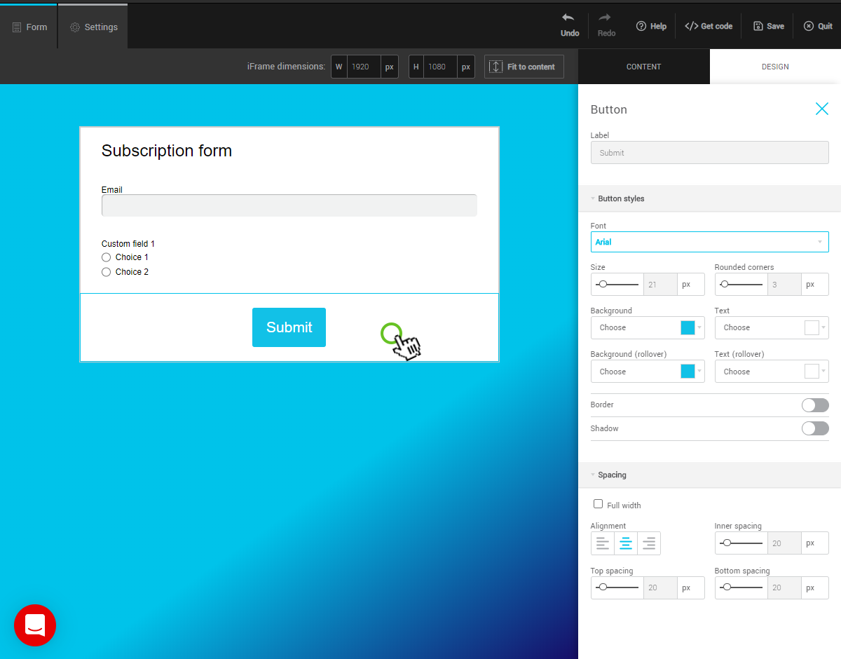
In the Form preview, click the Button row to display the options in the right sidebar.

Customize colors and hover appearance
In the Button styles menu, the four color fields allow you to control the button’s appearance in its static state and when the mouse hovers over it.
Here are some possible options:
.png)
Bordered with a transparent background, color changes on hover
.png)
Button is bordered by shading effect
.png)
3D effect with interior shading
Button size
In the Spacing menu, check the Full width box or use the Inner spacing option to edit your button. Please note that if your button is too big it can cause display issues. On a phone, the button will always appear full width.