In this article:
The Global Statistics page gives you an overview of your account’s performance. It brings together different data to help you analyze your mailings, track the evolution of your contacts, and review your last billing period history.
With the new statistics page, you can:
- track the performance of your mailings
- analyze your open and click rate trends
- understand the changes to your contact list
- monitor unsubscribes and reported abuse
- view information related to your plan and billing periods.
You can analyze the data over different time periods, export it as an Excel file, or print it as needed.
Accessing global statistics
To access global statistics, click in the left-hand menu.
Understanding the statistics page
The page is divided into three tabs:
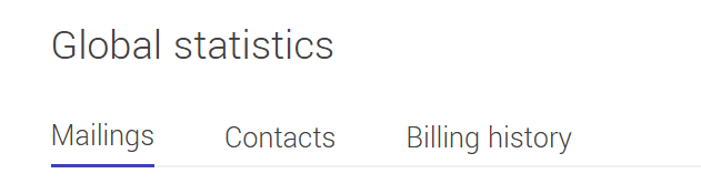
Each tab displays a type of statistics used to analyze the data associated with your account.
Before you start
Before you start to analyze your statistics, you can adjust the selected time period using the date selectors available on the page.
You can display data for predefined ranges (such as the last 30 or 90 days), all available data (Since the beginning), or a custom period.
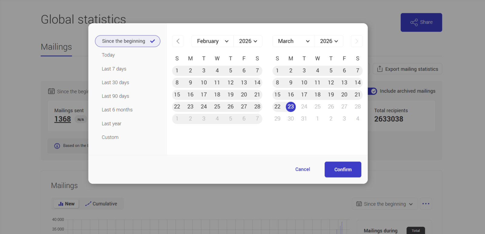
When the period is modified, the graphs, totals, and tables automatically update to reflect only the data within the selected range.
In the mailings tab, there is an option that allows you to include or exclude archived mailings in the displayed statistics.
See the section Include archived mailings for more details.
Mailings statistics
This tab provides an overview of your mailings performance based on the selected time period. It allows you to quickly analyze overall results and then explore the details of each mailing.
The data displayed in this tab varies depending on the selected period. Some sections, such as graphs and charts, have their own date selector, allowing for more precise analysis.
The top section displays key mailings indicators.
You will find, among others:
- Total mailings
- Average open rate
- Total recipients
- Average click rate
- Delivered
- Total unique clicks per link (sum of unique clicks on all links across all mailings in the selected period)
- Total opens
- Unique clicks (sum of unique clicks across all mailings in the selected period)
These indicators provide a quick overview of your mailing overall performance. They are calculated based on the selected period.
Include archived mailings
The Include archived mailings option (disabled by default) allows you to include or exclude archived mailings in the key indicators displayed at the top of the tab.
- When enabled, statistics include all mailings, both previous and archived mailings.
- When disabled, archived mailings are excluded, and only previous mailings are considered.
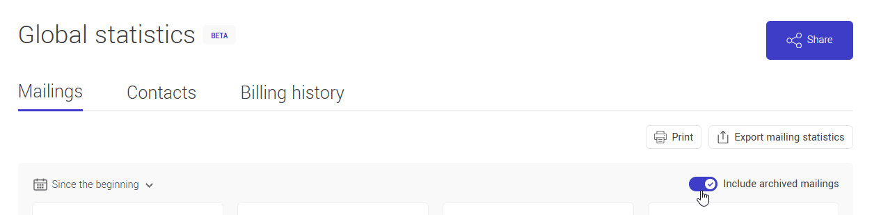
This option may impact the displayed results and allows you to adjust your analysis. It only affects the key indicators at the top of the tab and has no effect on the graph, side panel, or the mailings list below the graph.
Mailing performance graph
A trend graph shows you the performance of your mailings over time.
It helps you:
- identify trends
- compare periods
- observe variations in your metrics (opens, clicks, etc.)
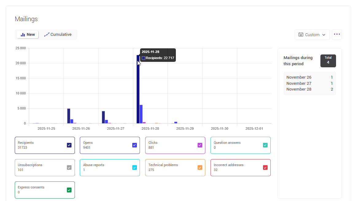
Learn more about statistics trends >
Mailing table
Below the graph, a table lists the mailings included in the selected period.
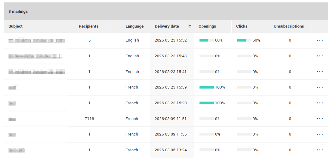
For each mailing, the action menu allows you to:
- access target groups
- view detailed statistics
- export statistics
- open the online version of the mailing
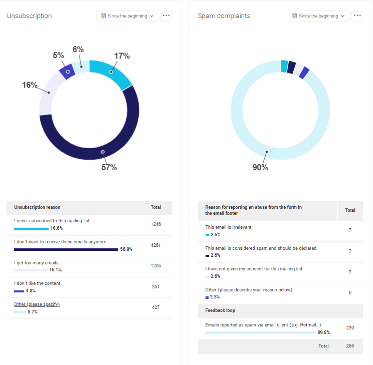
Unsubscribes and abuse analysis
Donut charts display:
- unsubscribes
- reported abuse
during the selected period.
These charts help you understand recipient behaviour and identify potential issues.
Learn more about unsubscribes and abuse >
Contact statistics
This tab allows you to analyze how your contact list changed over time based on the selected period.
It helps you see how your contact list has grown, contacts cleaned, and other changes over time.
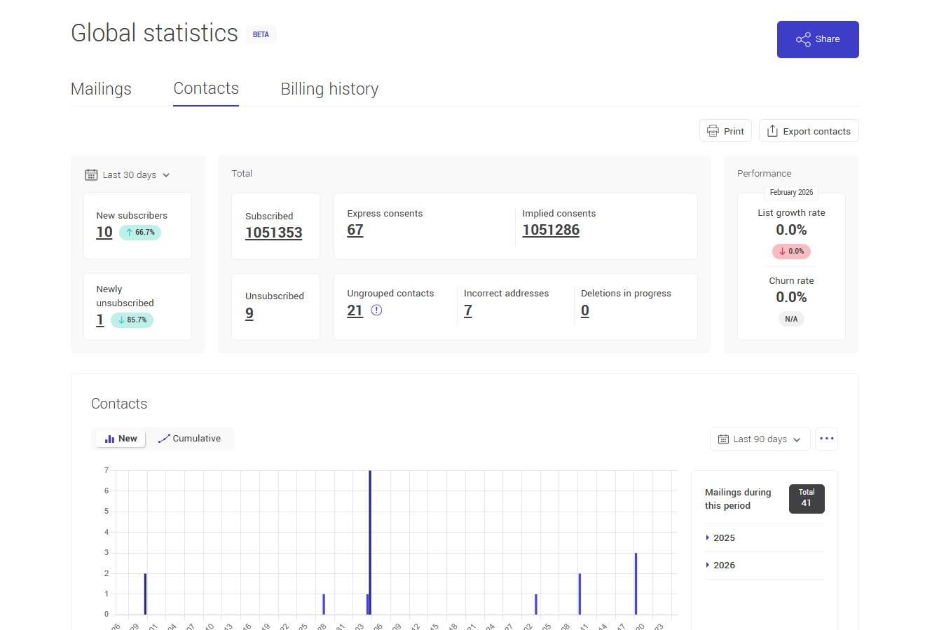
Key indicators
The top section displays key contact indicators, divided into two types:
Indicators that vary by selected period:
- New subscribers
- New unsubscribes
Indicators that reflect the current state of your account:
- Total subscribers
- Total unsubscribes
- Express or implied consent
- Contacts without a group
- Invalid email addresses
- *Pending deletions
*This number represents contacts manually deleted during the current billing period. These contacts are not permanently removed immediately and can be restored until the end of the current period. After the billing period ends, they are permanently deleted.
These indicators help you quickly assess the growth, quality, and compliance of your contacts.
A panel on the right also displays performance indicators such as growth rate and churn rate, calculated for the previous month.
Growth rate
The growth rate indicates how your contact list has grown. It accounts for new subscribers and lost contacts (unsubscribes, invalid addresses, and deletions).
A positive rate means your list is growing, while a negative rate indicates a decrease.
This rate is calculated for the previous month by comparing additions and losses to the number of active contacts at the beginning of that month.
Calculation:
(New subscribers − Lost contacts) ÷ Subscribers at the beginning of the month × 100
Churn rate
The churn rate represents the proportion of contacts you have lost, including unsubscribes, invalid addresses, and deleted contacts.
A high churn rate may indicate an issue with list quality or content relevance.
This rate is calculated for the previous month based on lost contacts compared to the number of active contacts at the beginning of that month.
Calculation:
(Lost contacts ÷ Subscribers on the 1st of the month) × 100
Contact evolution graph
The graph illustrates changes over time for indicators such as:
- subscriptions
- unsubscribes
- invalid addresses
- technical issues
- consent types
.png)
It helps you track growth and analyze the impact of your actions.
Learn more about statistics trends >
Unsubscribes and abuse analysis
Donut charts allow you to visualize the distribution of unsubscribes and reported abuse for the selected period.
They provide a quick overview of unsubscribe reasons and reports submitted by recipients, helping you better understand their behavior and identify potential issues related to your sends.
To learn more about these indicators and how to interpret them, refer to the Unsubscribes and abuse analysis section.
Map
At the bottom of the page, a map shows the distribution of contacts by country. The countries displayed are based on the data stored in contact profiles.
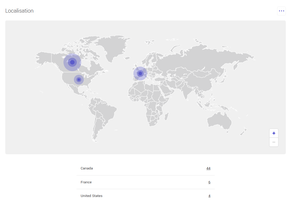
When geographic information is available, you can zoom in or out using the + and − buttons or your mouse wheel to view specific regions in more detail.
The action menu allows you to export the displayed results.
Contacts by country table
Below the map, a table shows the number of contacts for each country.
You can click the number associated with a country to directly access the corresponding contacts list.
.png)
You will be redirected to the Contacts tab with an advanced search already applied based on the selected country.
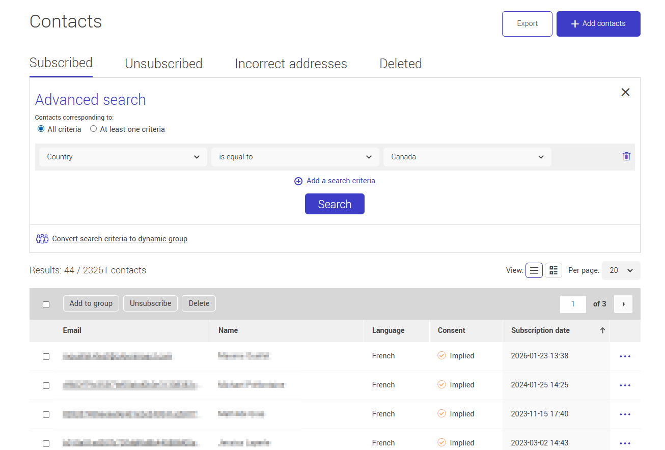
Learn more about advanced search >
Statistics trends
The Mailings and Contacts tabs include a trend graph that allows you to visually analyze data based on the selected period.
This graph displays changes over time for the indicators shown in the active tab. It automatically adapts to the selected parameters (period, display mode, and enabled series).
Reading the graph
The vertical axis represents the volume associated with each active indicator, while the horizontal axis represents time based on the selected period.
The time unit displayed on the horizontal axis automatically adapts:
- per day for periods under 6 months
- per month for periods under 3 years
- per year for longer periods
A panel on the right side of the graph shows a summary of the data for the selected period, including the total and a breakdown by time interval (days, months, or years, depending on the selected period).
Display mode: New or Cumulative
A toggle allows you to switch between two display modes: New and Cumulative.
![]()
![]()
In New mode, the graph displays only new occurrences for each date within the selected period.
For example, in the Contacts tab, this may represent the number of new subscribers or unsubscribes for a given day. In the Mailings tab, it corresponds to mailings or actions generated on that day.
In Cumulative mode, data is added over time. The graph shows overall progression rather than daily variations. This mode is useful for visualizing contact list growth or mailing volume over time.
Date range selector
A date range selector allows you to adjust the analyzed interval. You can display predefined ranges (such as the last 30 or 90 days), all available data (Since the beginning), or a custom period.
.png)
Displayed periods follow the time zone configured in your account.
When the period is modified, the graph and totals update automatically to reflect only the data within the selected range.
It is not possible to select a date earlier than your account creation date.
Exporting graph data
The action menu associated with the graph allows you to export the displayed data.
The export reflects the selected parameters, including the chosen period and the display mode (New or Cumulative).
Displayed series in the graph
Below the graph, indicators can be enabled or disabled to customize the display. Each indicator corresponds to a visual series in the graph.
In the Mailings tab, these series relate to sending performance, such as recipients, opens, clicks, unsubscribes, technical issues, or invalid addresses.
In the Contacts tab, series relate to database evolution, such as subscribers, unsubscribes, invalid addresses, or consent types.
Users can compare multiple indicators or focus on a single one.
Unsubscribes and abuse analysis
In the Mailings and Contacts tabs, sections display an analysis of unsubscribes and reported abuse.
Two donut charts provide a visual overview of:
- the distribution of unsubscribes based on the reasons selected by contacts
- reported abuse, which may come from:
- the Report abuse form
- the Mark as spam button in the email client (feedback loops)
Learn more about unsubscribes >
Learn more about abuse reporting >
Below each chart, a table details:
- the different reasons
- the associated percentage
- the total number of cases
A date selector allows you to analyze this data over different time ranges:
- Since the beginning
- Last 7 days
- Last 30 days
- Last 90 days
- Last 6 months
- Last year
- Custom
The action menu associated with these sections also allows you to export the displayed results.
Billing period history
This tab displays your billing period history along with related information.
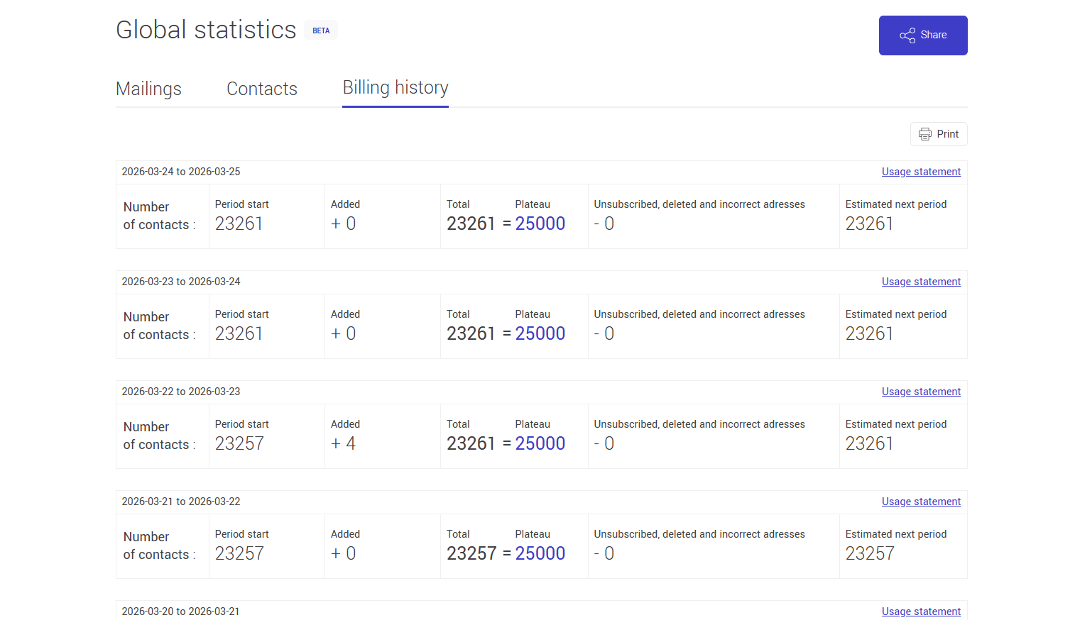
For each period, you can view:
- the number of contacts at the beginning of the period
- additions made during the period
- total contacts
- your plan tier
- the number of unsubscribed, deleted, or invalid contacts
- the estimate for the next period
This information helps you track the evolution of your contact database in relation to your subscription plan.
Usage report and invoices
For each period, a link to the usage report or invoice is available, depending on your payment method.
Clicking this link opens a window showing invoice details, including:
- invoice number
- account number
- billing date
- total charged
- plan details
- taxes (if applicable)
- payment status
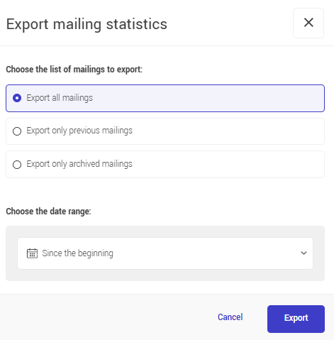
Exporting statistics
The Export button allows you to download certain data as an Excel file, depending on the tab you are in.
In the Mailings tab
You can export mailings statistics by selecting:
- all mailings
- previous mailings
- archived mailings only
You can also select the desired time period.
In the Contacts tab
You can export:
- contacts with a group
- contacts without a group
- unsubscribed contacts
- invalid email addresses.
If exporting contacts with a group, select the groups to include.
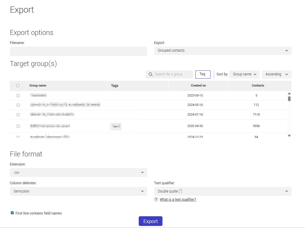
Exported data includes only the selected elements and may not reflect all information displayed on the page.
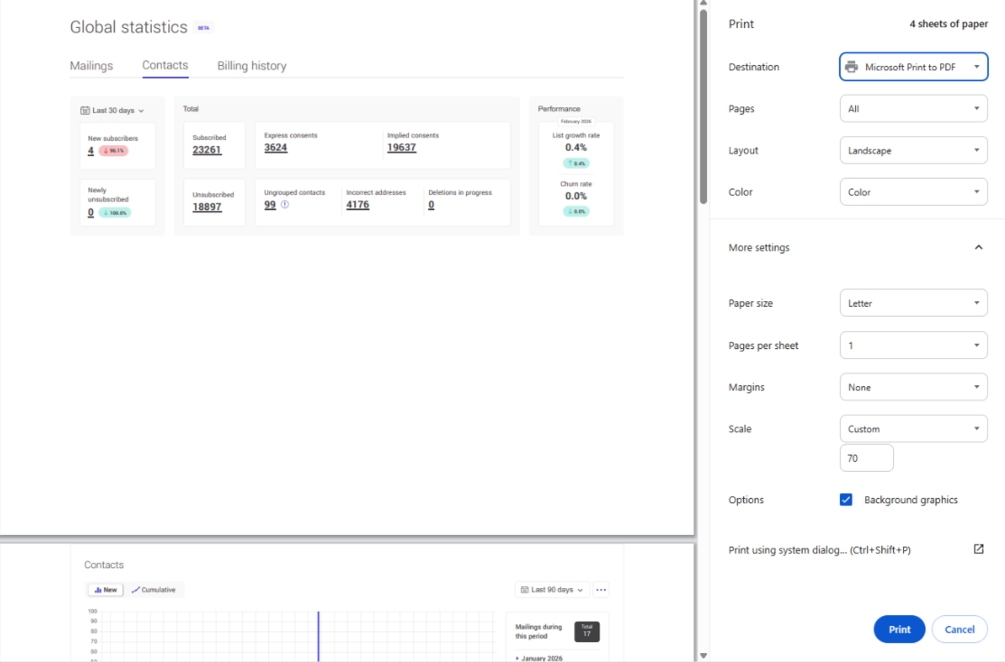
Printing statistics
The Print button allows you to generate a printable version of the displayed page.
This option is available in the three tabs:
- Mailings
- Contacts
- Billing period history
Printed data always reflects the currently selected tab, as well as the chosen period and applied filters.
Sharing global statistics
The Share button allows you to generate a shareable link to the global statistics page.
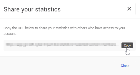
The link retains selected settings, including:
- the selected date range
- enabled or disabled series in the graph
- active options (such as including archived mailings)
Anyone opening the link will see the same display preferences.
Frequently asked questions
Why doesn’t the growth rate or churn rate match the current month?
These indicators are calculated for the previous full month. For example, if you are viewing statistics in March, the displayed data corresponds to February.
Can I share statistics with someone?
Yes. The Share button generates a link that retains your display settings. The recipient must have access to the account and be logged in.